
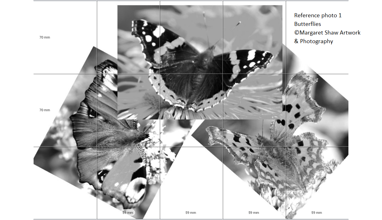
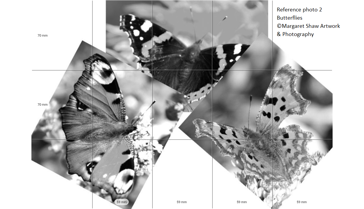
The inspiration for this decorative butterfly image has been worked from 3 separate photos that I’ve played about with on the pc to create a composition that fits onto A4 paper. I’ve also made them monochrome to help with your pencil drawing tonal values.
These are available for download and you can print them. Reference 1 Reference 2
If you’d like to arrange the butterflies differently you can cut these out and devise your own composition. Good composition will either have the butterflies separate or overlapping. Try to avoid having them just touching.
You’ll see a grid on the reference photos which is showing how the image will fit onto an A4 piece of paper. This has been done using the Art Grid app on a tablet. You load an image into the app, tell it what size of paper you’re working on, crop the photo to fit the paper and the app works out the measurements.
For an A4 piece of Paper you’ll mark out 3 columns horizontally each measuring 70mm and 5 columns vertically each measuring 59 mm.
Mark out the grid on your paper as described. Don’t be heavy handed with the grid lines as you’ll want to remove the marks as we start to fill the outline the drawing.
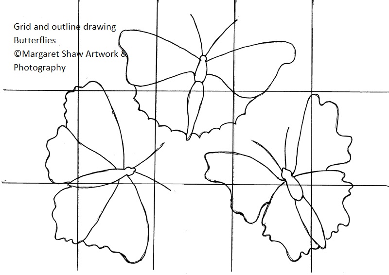
The drawing shows us looking down on the butterflies but the comma photo (bottom right butterfly) is slightly offset so you’ll need to even up the wing sizes by making the left ones bigger or the right ones smaller – you can see that the wings are about the same size in the outline drawing above.
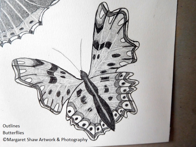
Using the grid as a guide draw the outlines of the butterflies. Don’t draw the outlines to heavily. If you make a mistake you can erase them.
If you’re not happy with a line, then draw in the new line before erasing the old one. Experience has shown that if you erase the incorrect line first you’re likely to re-draw it exactly the same way.
I sometimes find it helpful to drawn on the reference image to give myself a feel for where things are going.
Reference 1 Reference 2
I’ve also provided the outline drawing for download and A4 print so you can trace it. By tracing something you are still drawing and with more experience you’ll trace less and less. This example image has been inked so it would scan well.
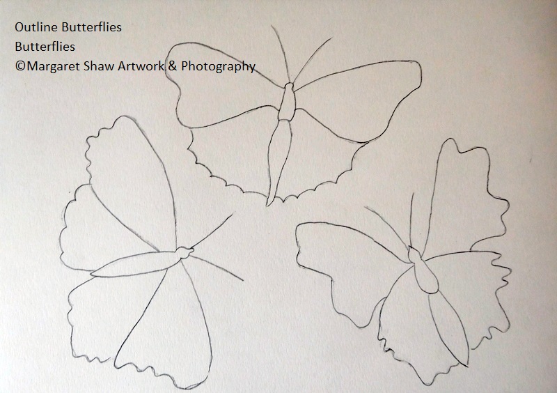
The next stage is to remove the grid lines so you have the outlines to fill in (I did say don’t be heavy handed with the grid). If you have been heavy handed with the grid – trace your drawing and transfer it onto a fresh piece of paper.
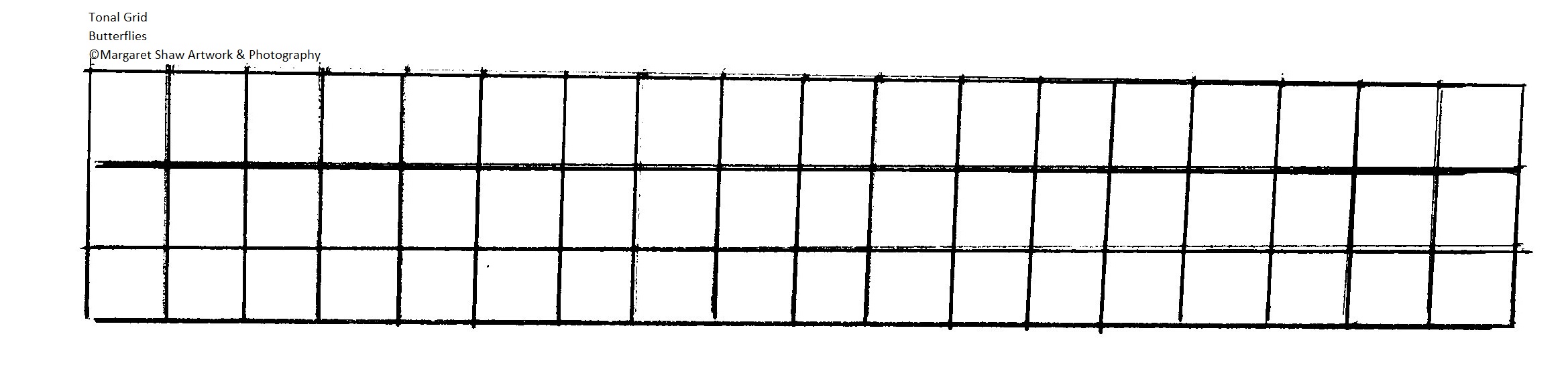
Before we start to fill in the picture, a little practice. We need to be able to create a range of tones with our pencil.
On a spare piece of paper draw a grid (mine’s 1cm squares). Then see how many tones you can get from your pencil. Use the lightest touch to draw the lightest grid and at the other end press on hard to get the darkest grid
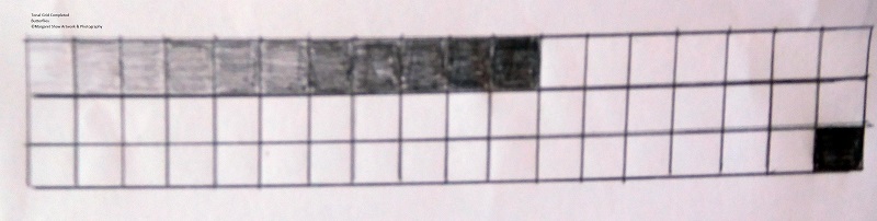
Here’s my attempt – not too many tones but enough to give me a range.
If you have pencils with different leads than you can get a wider range. H pencils give the lightest tones and B pencils give the darkest tones. But, as with this exercise, you can get a range with just the one pencil.
If pencil drawing is something you’d like to continue with, consider buying a set of different pencils H’s to B’s. The H’s are used for light tones and the B’s for dark tones. The B’s are softer and much easier on the fingers when blending. My sets are Derwent and Winsor & Newton. However for this series of tutorials I promised just one pencil.

To help throughout your drawing, I suggest you view on screen or download / print the finished piece.
There’s quite a lot of work in this image so do remember to take breaks. The joy of pencil work is that you can leave it for a while as there’s nothing to spoil – unless you have helpful children or pets.
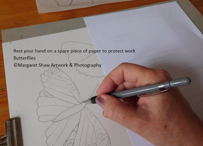
You’re going to fill in the patterns for each butterfly. To help protect your work and the paper it’s a good idea to put a piece of clean paper over the work already done. If you do get pencil marks on the paper rub then out as soon as you notice. Otherwise they may get rubbed into and stain the paper.
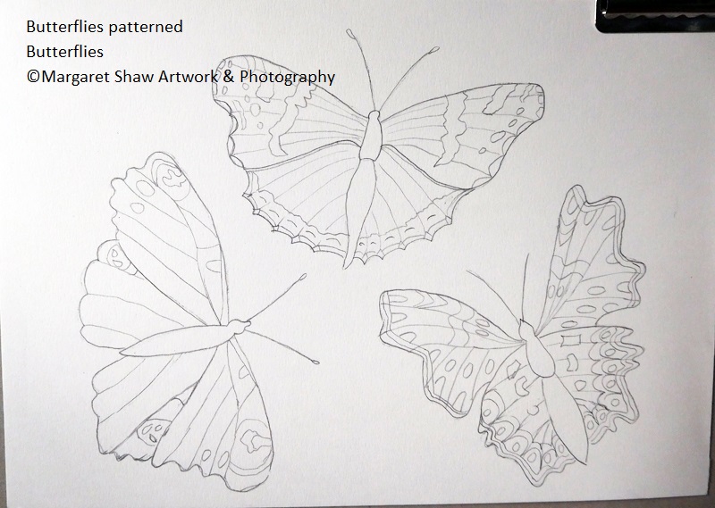
Looking at each butterfly in turn draw in the markings. Use the reference photos ( ref 1 ref 2 ), the finished piece or the butterfly patterns download to help. Sometimes its difficult to see what’s happening on the photo – time to use artistic license and create what you think looks good. Patterns on the butterflies aren’t exactly symmetrical and also depend on how wide the wing is open and the angle of flight.
Each butterfly is shown individually below.
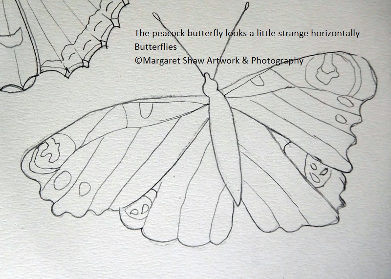
The peacock on the bottom left doesn’t look right when turned horizontal
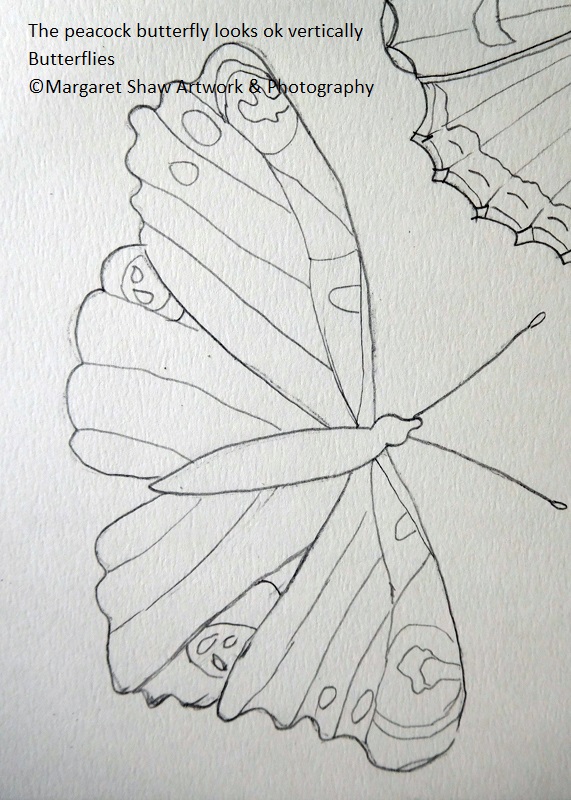
But turned vertical looks Ok
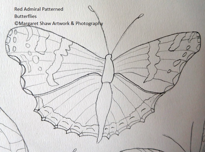
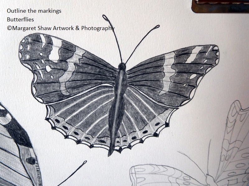
In the Centre is the admiral – slightly more complex patterns than the peacock
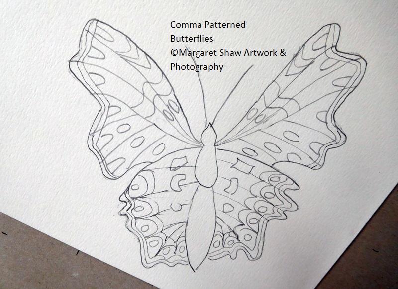
The most complex patterns are the comma
Once you’ve got your patterns in place you’ll shade in the butterflies
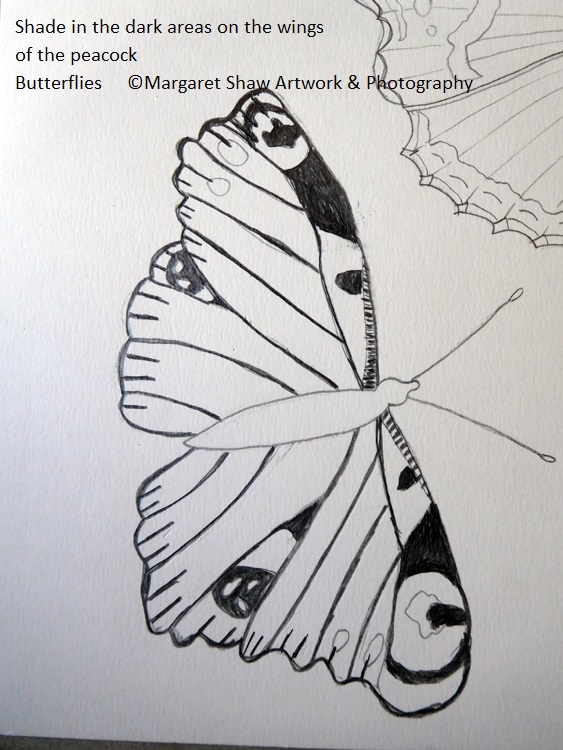
Use ref photo 2 and the finished piece to start with the bottom left peacock butterfly. Press on heavily with the pencil and shade in the darkest areas on the wings.
As the reference photo is clearer on the top wings you’re working from the tonal values there. Note there’s a slight change in the pattern on the top left wing with a slope in the dark area leading into the eye.
Outline the wings with a heavy line.
Add the dark lines coming in from the edge of the wings and make the veins dark.
Note the tiger stripe strips at each side of the head.
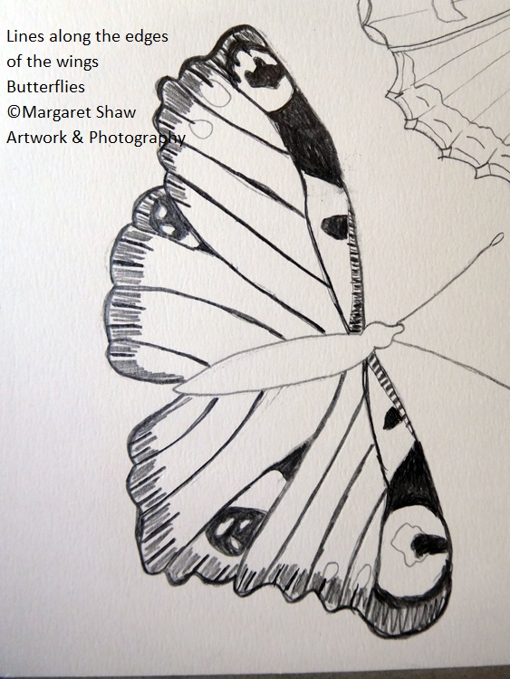
Place fine dark lines along the edges of the wings surrounding the heavy lines, but leaving some white showing.
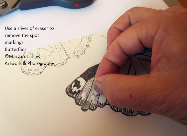
Using a sliver of clean eraser rub out the lines that mark out the spots on the wings. You’re filling in between the veins with long lines leaving the white spots clear. Also note there is a small white area at the edge of the tiger stripes.
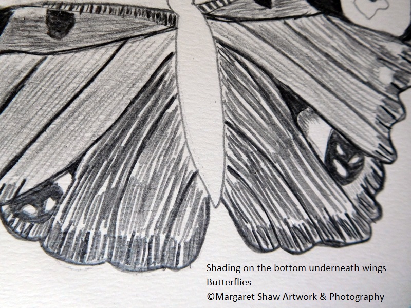
Onto the underneath wings – there is some shading around the edge of the eye on the bottom right. As with the top wings, long lines between the veins but heavier and darker than the top ones. No spots to worry about here.
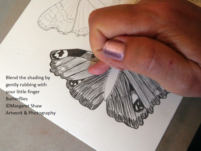
Next use your little finger to blend in the shading. Where you have the white spots, pull away from the areas. If you do push pencil into the white spots, use a clean sliver of eraser (cleaned by rubbing across a clean piece of spare paper), press hard and wiggle in a circular motion.
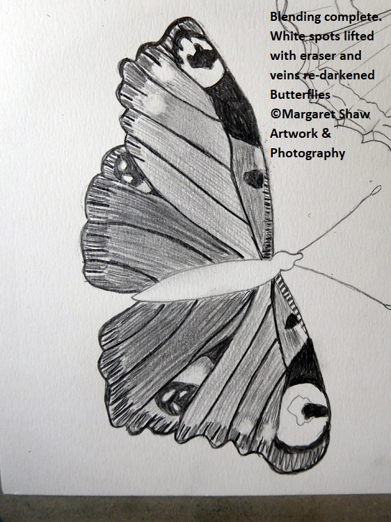
You may lose some of the vein definition whilst you blend – just put it back.
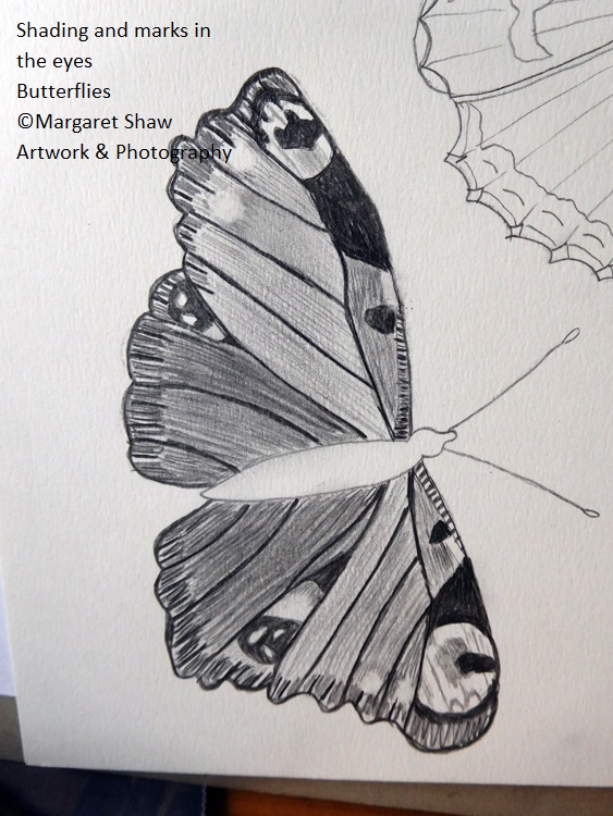
Back up to the top wings with light shading and markings around the eyes.
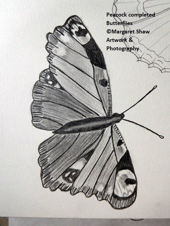
Last job on this one, the body and the feelers. Shade the body dark by pressing on heavily with the pencil then lift some of the pencil away in the middle of the body and head using a clean sliver of eraser.
Darken the feelers and create a small oval at the end.
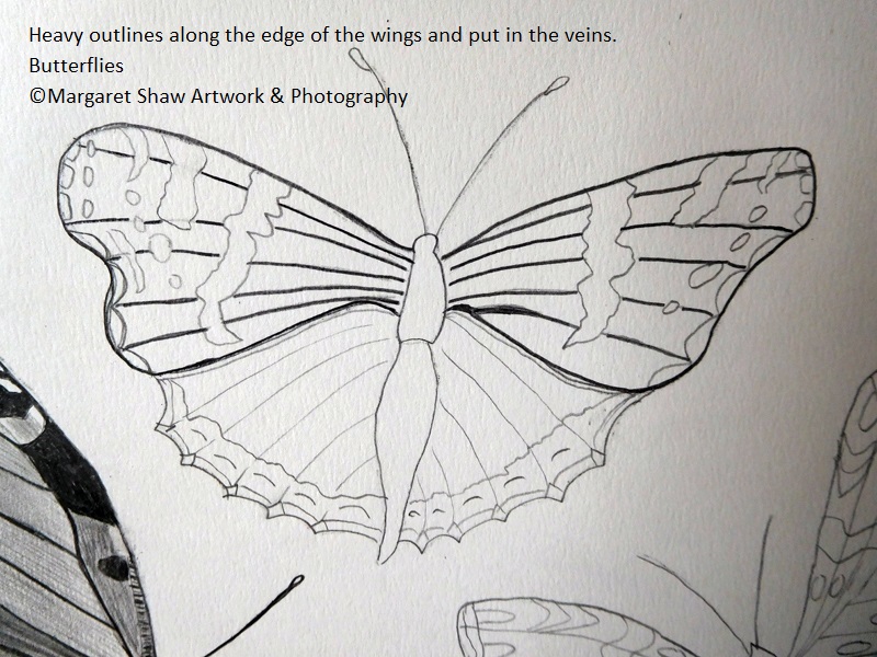
Onto the Admiral – unless you need to take a break?
You’ll start with the top wings. Not forgetting to cover your work already done – I’d hate you to smudge that Peacock.
You may find it easier to turn the piece upside down so you’re not leaning on work already done. You may also find that when to start to shade on this one it’s easier to have the work on its side.
Look at ref photo 1, or the finished piece as you work.
Put heavy outlines along the edge of the top wings. Put in the veins but at this point do not take the veins through the patterns.
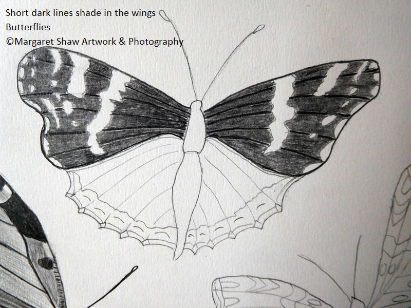
To shade in the wings use short dark lines following the line of the wing and going round the markings. If you start to lose the veins – go over them and put them back.
You may find it easier to build up the dark tone of this butterfly by going over your shading a second time. Pencil on top of pencil goes quite smoothy.
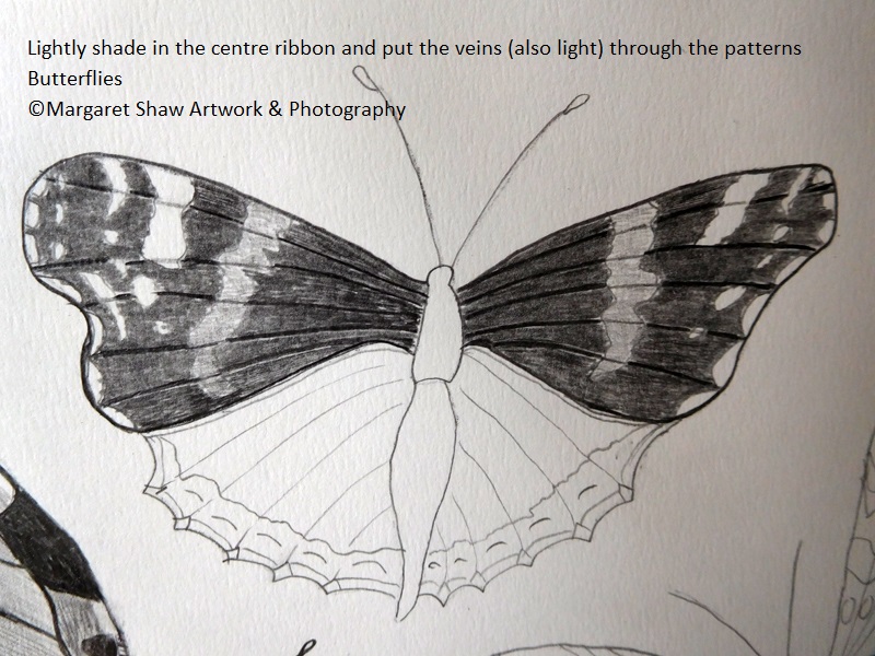
Lightly shade in the centre ribbon and then take the veins through the ribbon and the white patterns with a light touch.
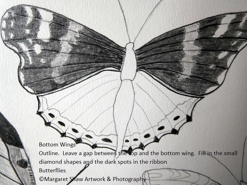
Onto the bottom wings. Outline the wings carefully leaving a gap between the top and the bottom wing.
Use heavy shading to fill in the small diamond shapes on the edge and the dark spots in the ribbon.
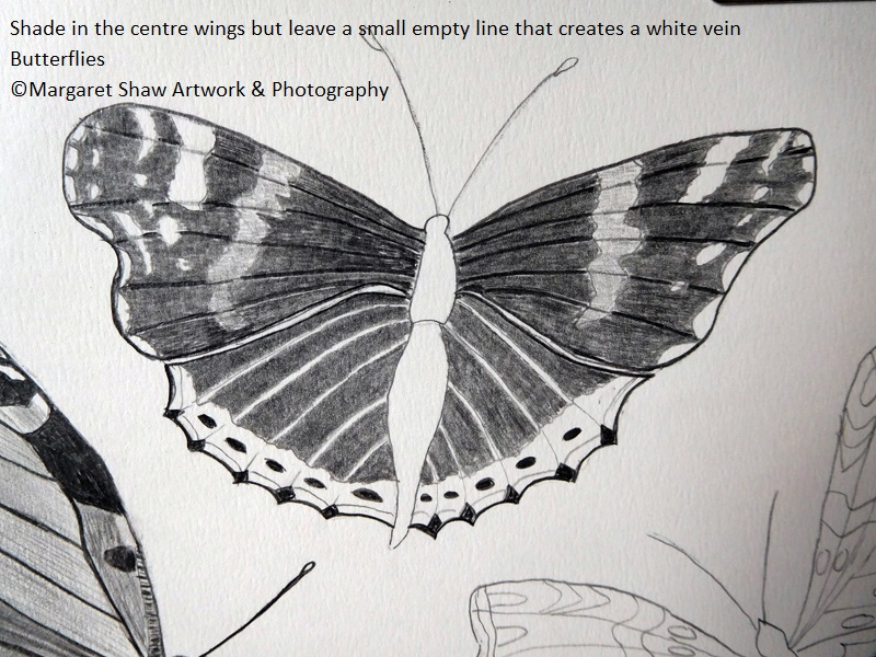
Shade in the centre of the bottom wings but leave a small empty line that creates a white vein. This is delicate work and you will need to take your time and keep your pencil sharp. Also periodically give your fingers a stretch.
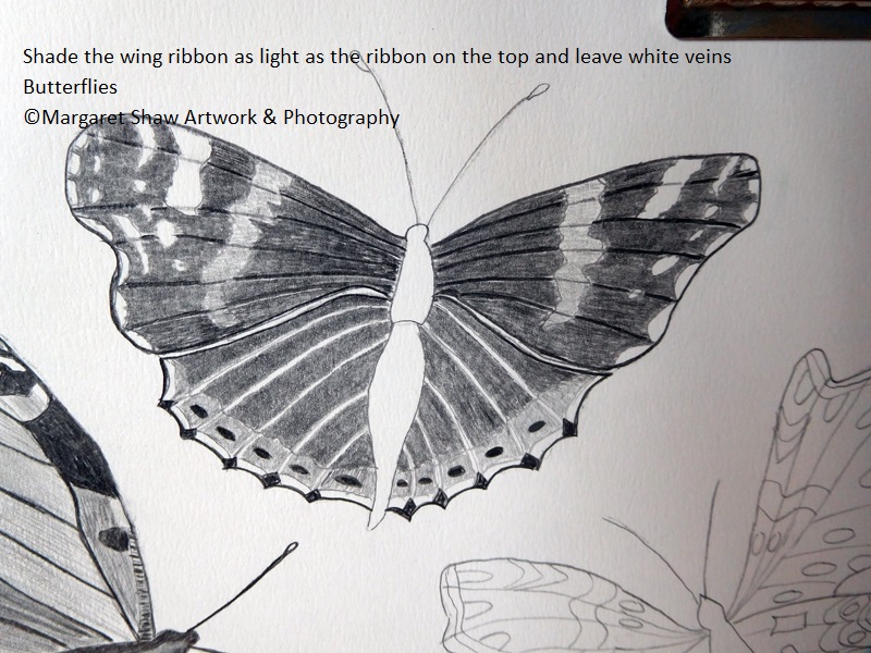
Shade the outer wing ribbon as light as the ribbon on the top wings and continue with the light veins. You may find it easier to lightly draw the vein lines in and then shade.
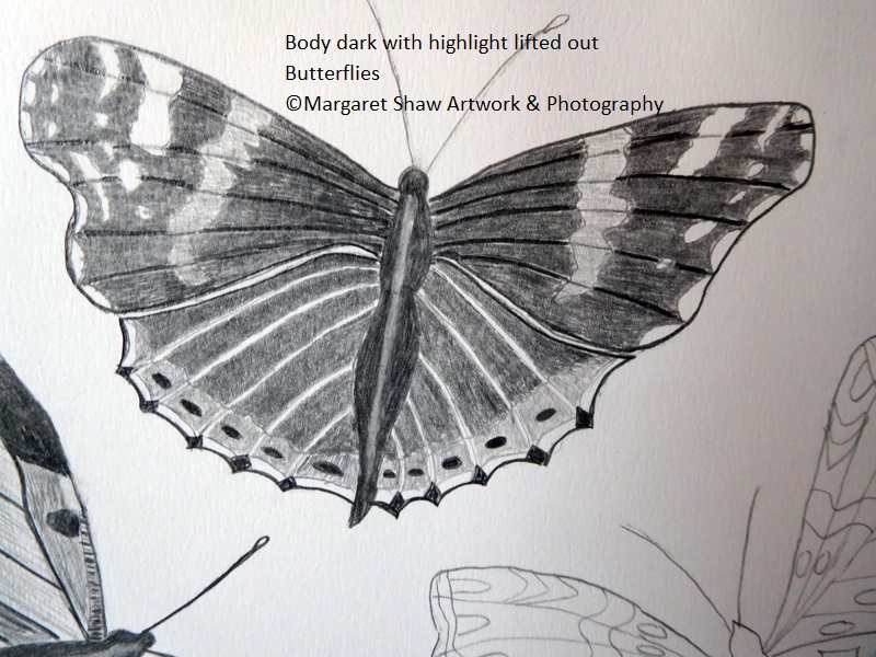
As with the Peacock, shade the body in darkly and use a clean sliver of eraser to lift out a highlight.
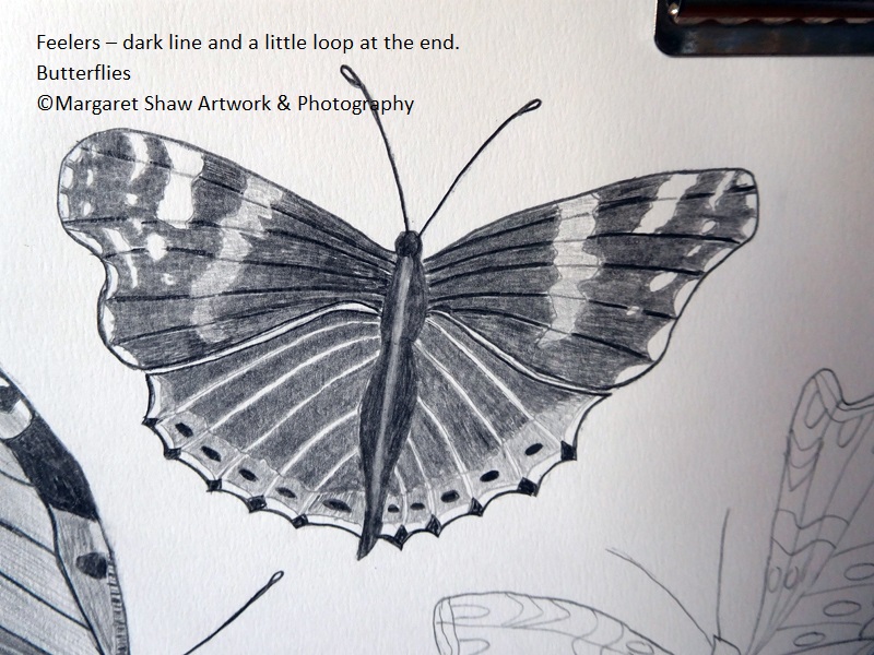
Feelers – again as with the peacock a dark line and a little loop at the end.
Keeping in view that these butterflies are a decorative design I decided to outline the markings and the ribbons. It also seemed to tidy things up. Do as many or as few outlines as you like.
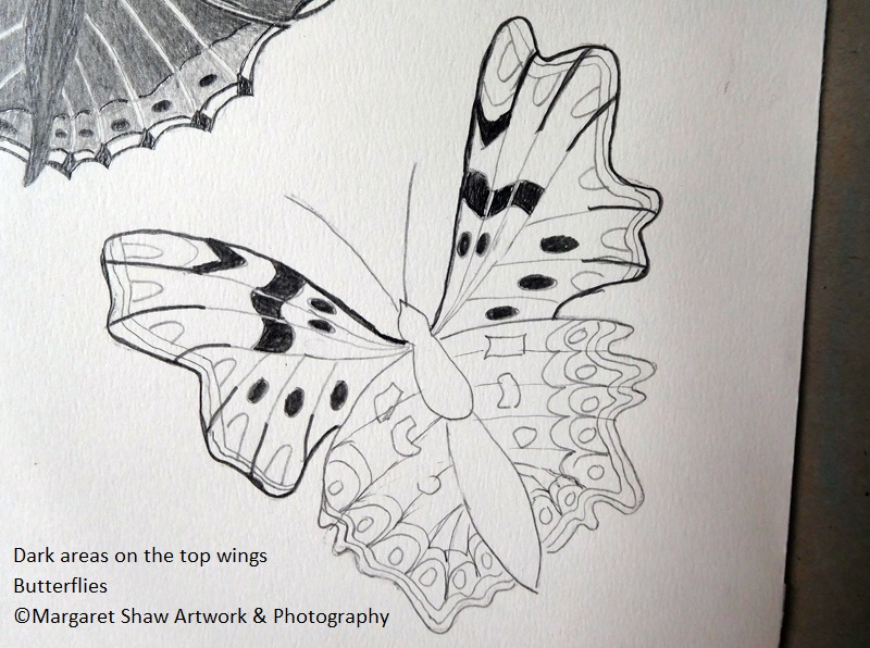
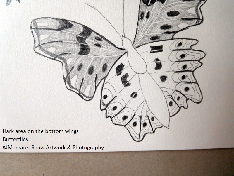
Lastly the comma. By now you should have a feel for where you’re going. Top wings then the bottom wings. Dark to light. Finally the body and the feelers. View the reference photo (ref 2) and/or the finished piece when working. This is the least clear reference and I’ve used artistic license in some of the areas where I couldn’t see clearly plus a few extra spots.
Starting with the top wings dark areas.
Outline the wings – remember to covered finished work and turn on side / upside down if easier. The veins are dark at the end and lighter in the middle so put in the dark lines. Fill in the dark spots but leave gaps in the dark spots where the veins go through. Then there are dark v shapes at the top of the wings.
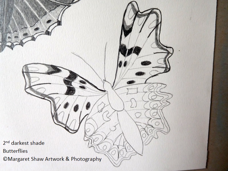
Onto the 2nd darkest shade of the inner ribbon along the wing edge and the area next to the dark V.
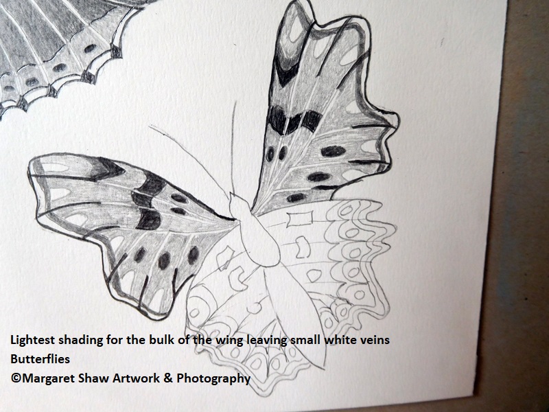
Small short lines to shade in the bulk of the wing and try to leave a white vein line with careful shading. Leave the egg shapes along the ribbon and the outer ribbon white.
On the bottom wings with artistic licence on the extra spots. As usual dark areas first - Outline the wing. Spots / marking leaving white vein lines.
Dark veins from the edge of the wing to the top of the egg shapes.
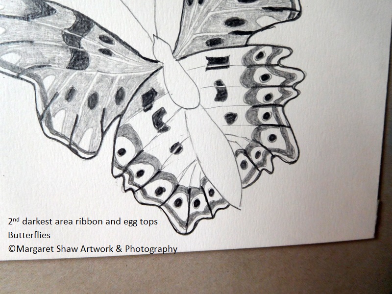
As with the top wing the 2nd darkest shade is the inner ribbon and the top of eggs.
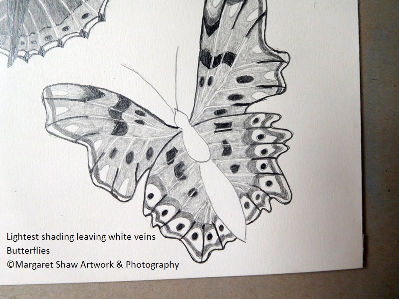
Shade in the bulk of the wing with lightest shade leaving white: the veins, the outer ribbon and the egg shapes.
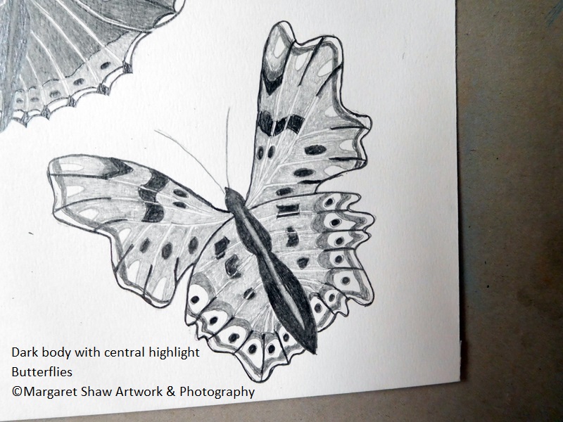
As with the other 2 butterflies fill in the body dark and lift out a central highlight with a sliver of clean eraser.
And onto some outlines – I did the ribbons and the eggs – do whatever you think looks nice.
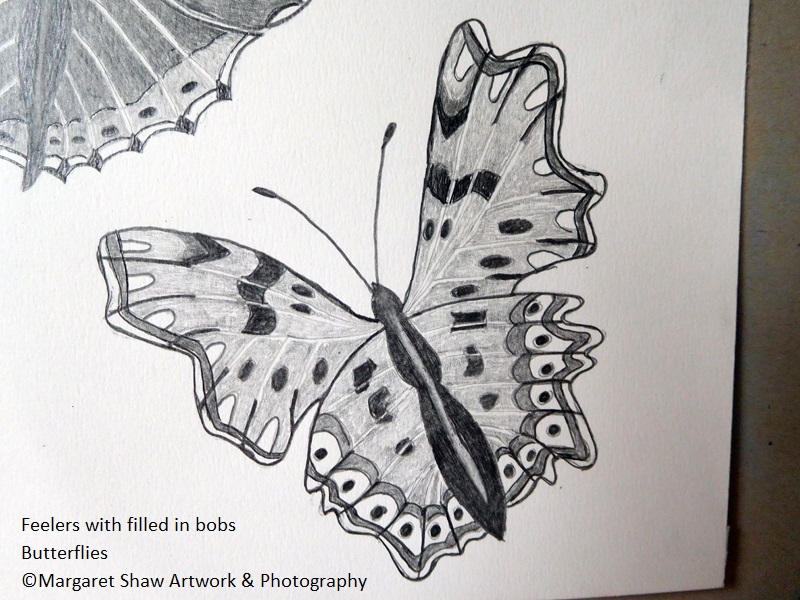
This time the feelers have filled in bobs on end.
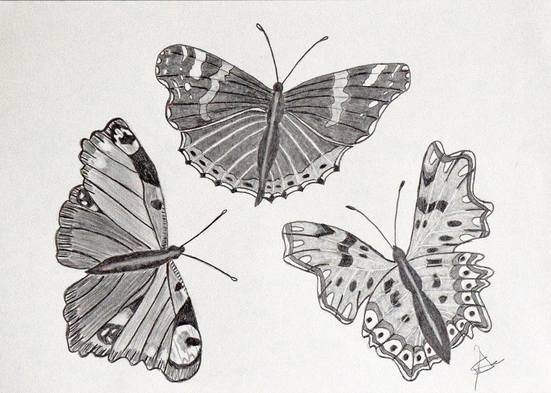
Final checks anything needs tweaking? Dark areas to be darkened more. Any pencil smudges on the paper?
When you’re happy add your signature.
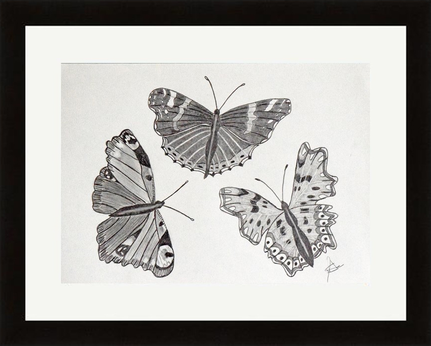
If you’re pleased with what you’ve done its quite amazing what a mount and frame can do for a piece of artwork.
A4 is a standard size and you should be able to buy a mount and frame without much difficulty.
If you’ve enjoyed this tutorial – let me know and I’d like to see your finished pieces.
E mail me your comments or send me photos of your finished pieces to – margaretshawartwork@gmail.com
Margaret.