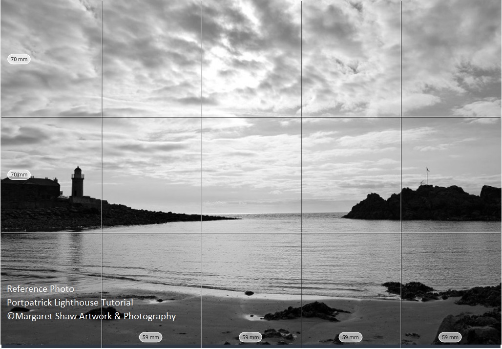
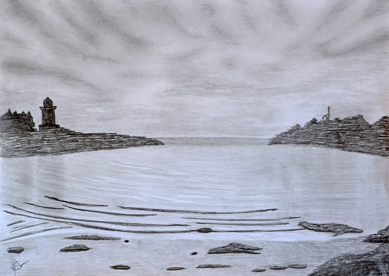
Here’s the photo that we’re going to work from. The image is almost monochrome naturally, but to emphasise this I’ve made adjustments in photoshop. All the colour has been removed leaving blacks through several shades of grey into pure white.
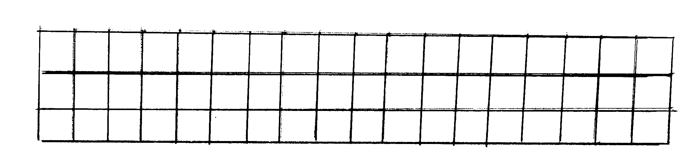
You’ll see a grid on the photo which is showing how the image will fit onto an A4 piece of paper. This has been done using the Art Grid app on a tablet. You load an image into the app, tell it what size of paper you’re working on, crop the photo to fit the paper and the app works out the measurements.
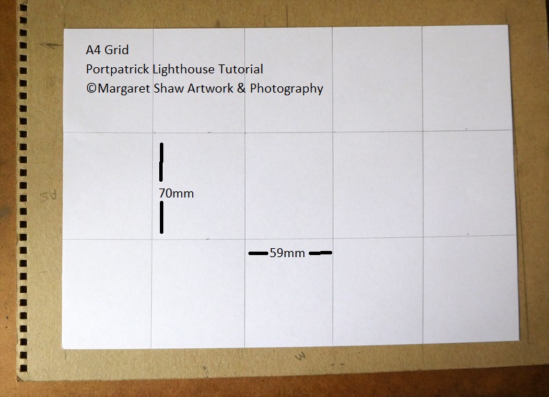
You can see that for an A4 piece of Paper you’ll mark out 3 columns horizontally each measuring 70mm and 5 columns vertically each measuring 59 mm
Mark out the grid on your paper as described. Don’t be heavy handed with the grid lines as you’ll want to remove the marks as we start to fill the outline the drawing.
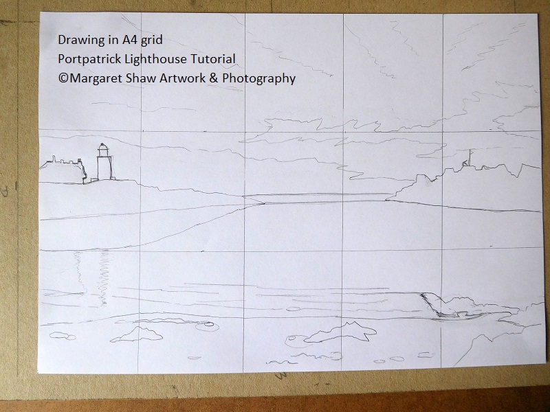
Using the grid as a guide draw the outlines of the scene. This needs to be fairly accurate as the scene will be recognisable to anyone having visited Portpatrick.
Don’t draw the outlines to heavily. If you make a mistake you can erase them.
If you’re not happy with a line, then draw in the new line before erasing the old one. Experience has shown that if you erase the incorrect line first you’re likely to re-draw it exactly the same way.
I sometimes find it helpful to drawn on the reference image to give myself a feel for where things are going.
Here's the link to the reference photo that you can download and print at A4.
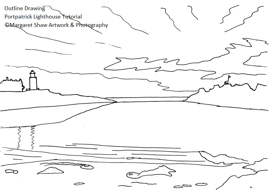
I’ve also provided the outline drawing for download and print so you can trace it. By tracing something you are still drawing and with more experience you’ll trace less and less.
The next stage is to remove the grid lines so you have the outline scene to fill in (I did say don’t be heavy handed with the grid). If you have been heavy handed with the grid – trace your drawing and transfer it onto a fresh piece of paper.
This example image has been inked so it would scan well.
As the drawing progressed I didn’t use the reflection of the rocks at the left so you can leave that out.
Before we start to fill in the picture, a little practice. We need to be able to create a range of tones with our pencil.
On a spare piece of paper draw a grid (mine’s 1cm squares). Then see how many tones you can get from your pencil. Use the lightest touch to draw the lightest grid and at the other end press on hard to get the darkest grid
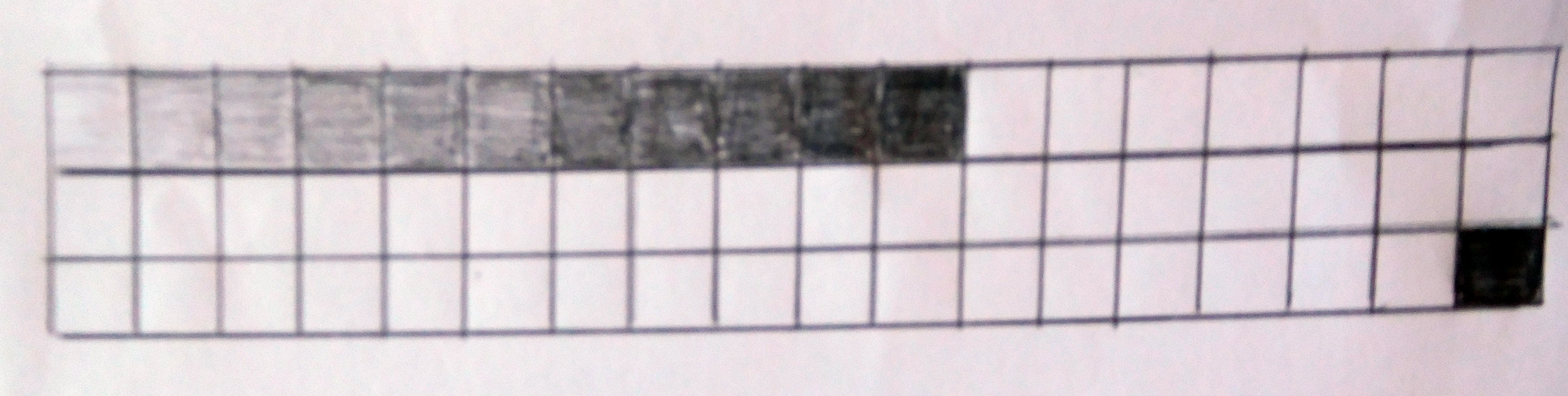
Here’s my attempt – not too many tones but enough to give me a range.
If you have pencils with different leads than you can get a wider range. H pencils give the lightest tones and B pencils give the darkest tones. But, as with this exercise, you can get a range with just the one pencil.

To help throughout your drawing, I suggest you view on screen or download / print the finished piece.
This is quite a lengthy tutorial so do remember to take breaks. With pencil you can leave the work at any point – nothing to spoil. Just make sure you move your work away from any helpful pets and children.
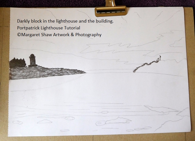
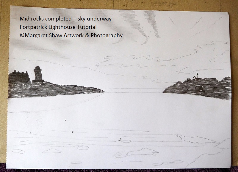
You’re starting with the darkest tones in the middle of the picture. Starting with the darkest tones means you know that all other tones have to be lighter. It seems easier to me to put less pressure on the pencil than more.
Pressing really heavily completely block in the lighthouse and the building. If you feel confident enough put the railings round the top of the lighthouse. If not leave them (the picture will still look fine). Note the chimneys on top of the building and the balcony that sticks out at the right hand side. For fine details – sharpen the pencil.
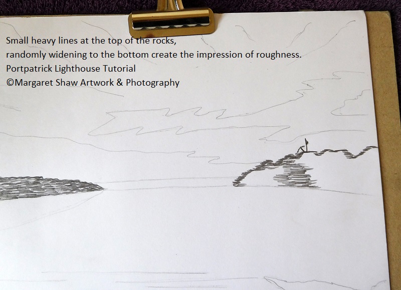
For the rocks do heavy random lines, small at the top of the rocks and widening as you come down. The gaps left naturally create the illusion of roughness.
On the right of the picture put in the flag and the anchor (sharp pencil needed)
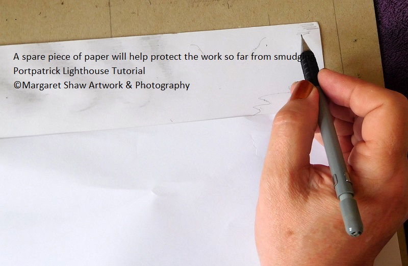
With your mid rocks completed – your sky gets underway. As you work the sky you need to protect the work already done from smudging – cover what you’ve already done with a spare piece of paper.
Also to prevent smudging:
If you’re right handed work left to right / top to bottom.
If you’re left handed then work right to left / top to bottom.
I suggest that you have a read through the sky section before you pick up your pencil.
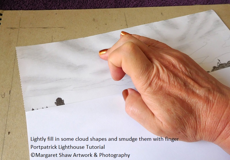
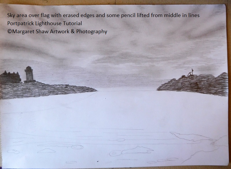
To put some cloud shapes in the sky. On the outline drawing you marked some lines in the sky to represent the direction of the clouds. The clouds at the top of the sky are forming a fan shape.
Starting at the top, working one cloud at a time – rub out the direction line (if you don’t take out the direction line you will end up with a line through the middle of the cloud). Next, lightly fill in a long triangular cloud shape. Then use a finger to smudge the pencil lines. You need to have your clouds different sizes and shapes. Some clouds even have a little kink at the bottom. Have a look at the finished drawing and the reference photo for some guidance.
Before starting on your finished piece, maybe have a practice on a spare piece of paper (I did).
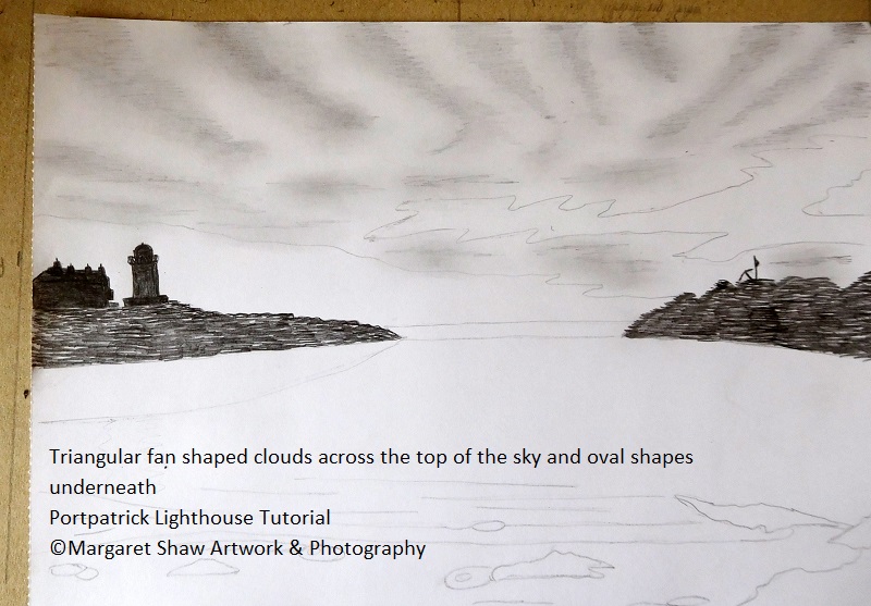
One you’ve completes the fan shape of the clouds in the top of the sky, underneath are some linear clouds. Use the same technique – remove the marker line and fill in an ovalish shape. Keep the shape and sizes a bit random – and blend in. You’ve two area of sky that have no large clouds (round the lighthouse and above the flag) so try to keep those clear.
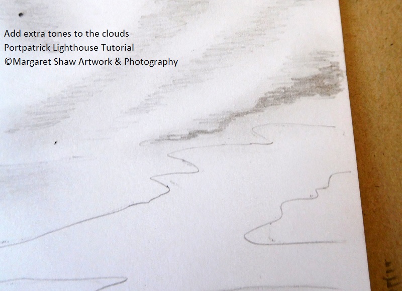
When your clouds are in place you need to add some tonal variations to them by putting on more layers of pencil and blending that in. Looking at the reference photo there are quite a few dark areas. This is a bit wearing on the fingers, but the more pencil you add the easier it gets. Pencil leads do contain some wax that enables the blending. The more pencil that’s applied the easier the blending gets.
If pencil drawing is something you’d like to continue with, consider buying a set of different pencils H’s to B’s. The H’s are used for light tones and the B’s for dark tones. The B’s are softer and much easier on the fingers when blending. My sets are Derwent and Winsor & Newton. However for this series of tutorials I promised just one pencil.
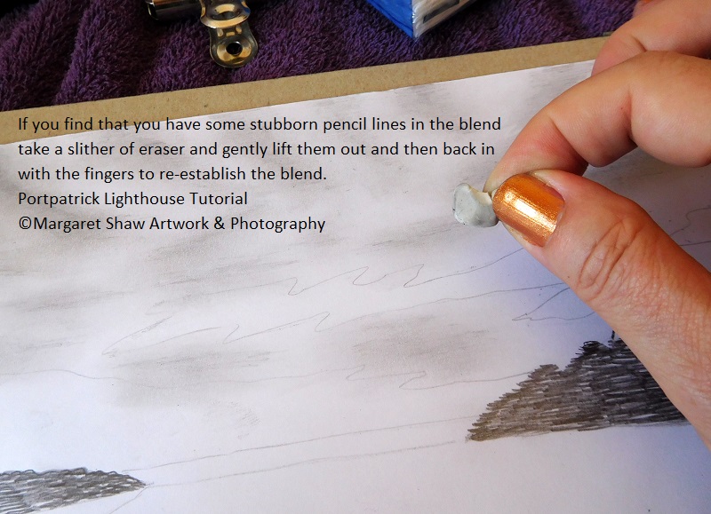
If you get pencil lines in the clouds that aren’t blending then take a sliver of eraser and rub at them, then back in with the fingers.
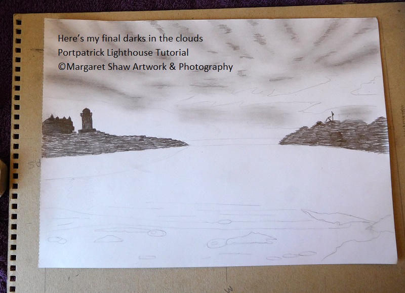
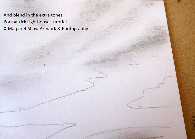
Keep adding more tones until you are happy with your clouds. This is my final set of darks ready to rub in.
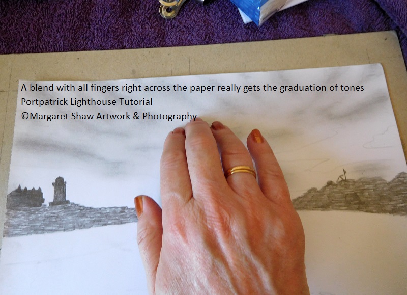
Rub all fingers across the paper to really make it blend – don’t worry about loosing the whites you’ll recover those later.
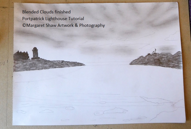
Here’s my finished blend of clouds
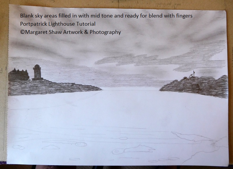
Next fill in the 2 blank sky areas with a mid-range shading tone and using fingers, blend.
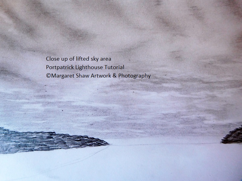
Now for my favourite part – getting the whites back. Using a sliver of eraser small zig zags around the edges of the sky areas. Then small lines in the centre to make the small clouds that appear here.
If your eraser gets dirty, clean it by rubbing on a spare piece of paper.
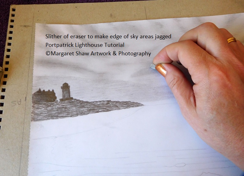
Do the same for the area of cloud that goes around the lighthouse and across the top of the water.
Now head to the top of the picture and lift out some areas of pencil to get the white highlights back. Look at the finished piece and the reference photo for guidance.
Keep in view the fan shape you created in the clouds at the top of the picture. If you lift too much out, then rub your fingers back into the pencil and drag it back in.
Rub your fingers over the edge of the white to eliminate any harsh lines If you get really carried away with your whites go back in with the pencil and redarken.
Keep at this process until you have something that you like.
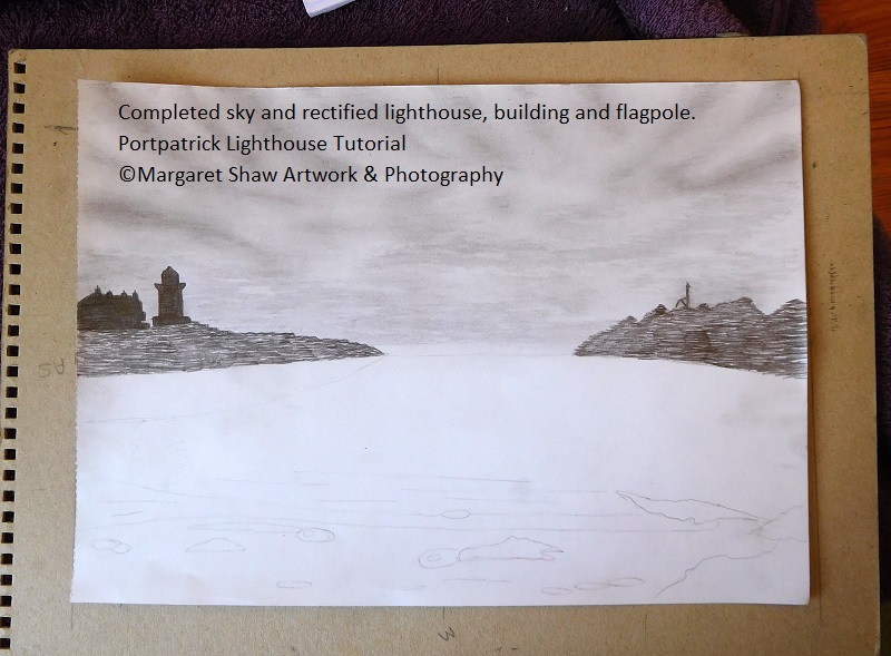
So that’s the sky completed. If you've read through doing the sky head back up the page and take it step by step. Don't forget to have a break.
Sit back from your work and have a good look at it.
At this point I noticed my light house was a bit wonky and the building was floating over the rocks. So straightened my lighthouse with a little more heavy pencil and filled in the gap between the building and the rocks. My lighthouse is a bit short and square as a result, but I can’t change that. My flagpole was on the short side so lengthened that.
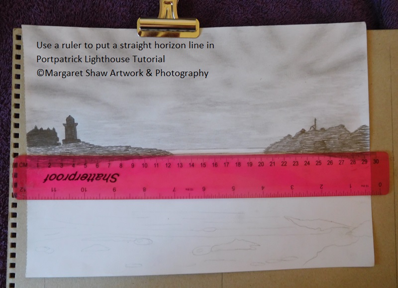
Moving into the sea.
Your horizon line needs to be straight. Use a ruler to put the horizon line in.
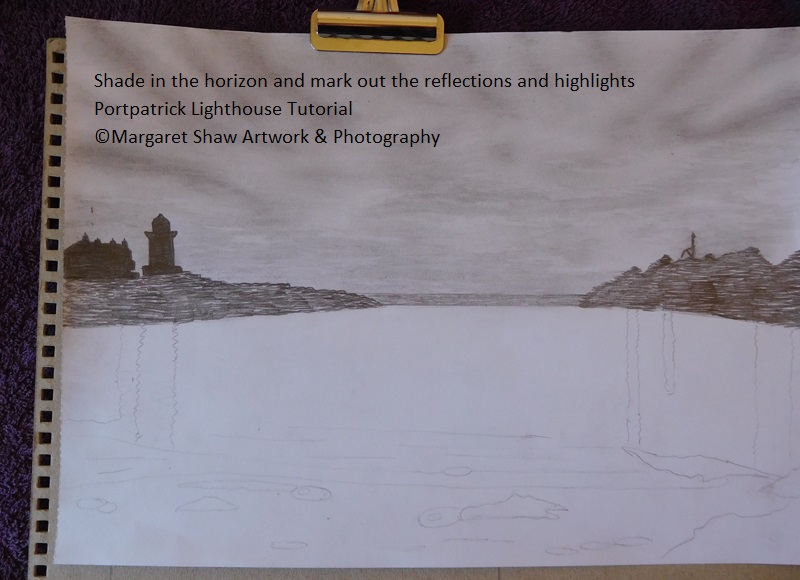
Then shade forward from the horizon line for about ½ centimeter
Looking at the reflections you’ll see dark reflections on the left from the lighthouse and the building. Coming straight down from these 2 put some light squiggly lines to show where you are going to shade. The lighthouse reflection reaches the sand area and the building reaches about mid way through the waves. Reflections in water are usually longer than the item being reflected.
On the right of the picture highlights are breaking through the top of the rocks onto the water. Wherever you have a gap in the top of the rocks you need to line up a highlight in your water. Squiggly lines again to do this. I started with three water highlights and then later decided there were four. As with the lighthouse and building these highlights will be quite long and in proportion to the depth of the gap. The longest from the deep V at the right of the rocks reaches just short of the front right rock in the water.
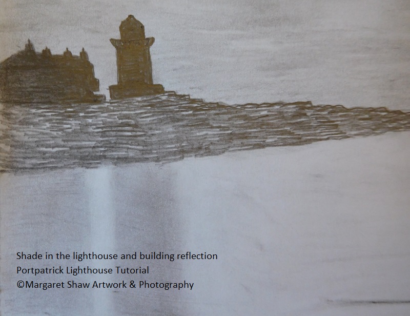
Now shade in the lighthouse and the building reflections and blend the shading with your finger.
If you lose the white highlight between the lighthouse and the building, use your sliver of eraser to lift the pencil off. Likewise, if your lighthouse reflection gets too wide – just lift the excess away. Use your finger to gently smudge away any harsh lines.
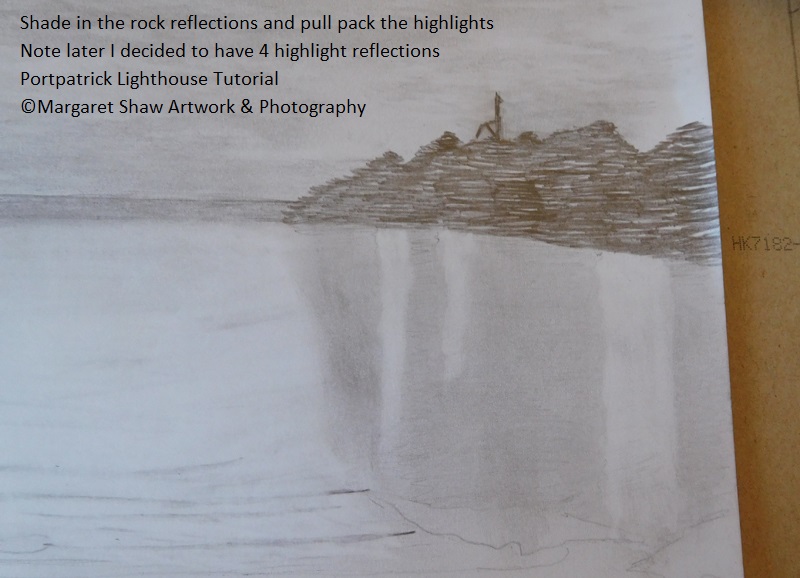
Over to the right and shade in the reflections from the rocks and blend with fingers, leaving gaps for the highlights.
This is where I made a howler. Instead of shading in the rocks, I shaded in the thin highlights and started work on the ocean before I realised. There was a lot of rubbing out to do so I ended up with some paper damage. That was covered by dark reflections which also ended up too long. You’ll see later on how I sorted those out.
So please take heed.
- The squiggly lines on this side of the picture are highlights – the opposite of the work done on the left.
- The rock reflections are fairly light so don’t do the shading too dark.
- The longest highlight at the right stops before the rock in the water.
When you blend this shading with your fingers your highlights may disappear. Get your highlights back by using that sliver of eraser and lift side to side. If you get a harsh line between the shading and the highlight, back in with your finger along the edges.
Don’t forget to give the eraser a clean periodically on a spare piece of paper.
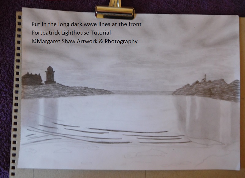
Onto the dark wave lines at the front of the water. There is a slight arc to them. One large one goes across the front and intersects a rock in the middle of the picture. The others need to be different sizes that in some places have gaps and others cross over.
There are three wave lines at the bottom left of the picture at about a 45 degree angle to the main waves.
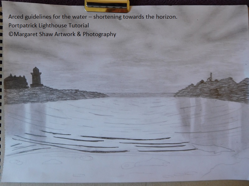
There are arced lines to represent the rest of the sea in the bay and they reduce in size as you work back to the horizon. Mark some of these in as guides for filling in the ocean.
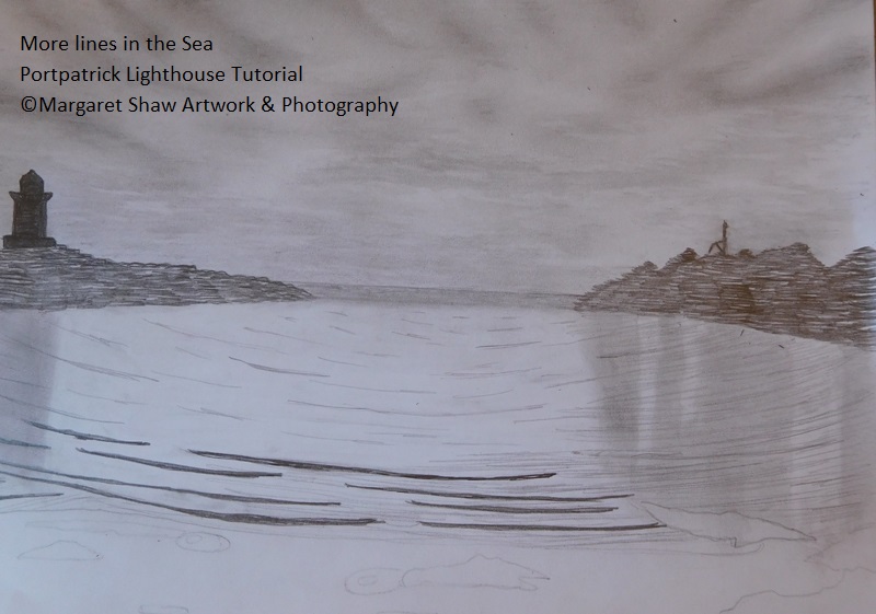
Using your guidelines start to lightly fill in more lines in the sea. Longer lines at the front between the wave lines, reducing in size as you work back to the horizon. The sea is quite a light tone so don’t press on heavily.
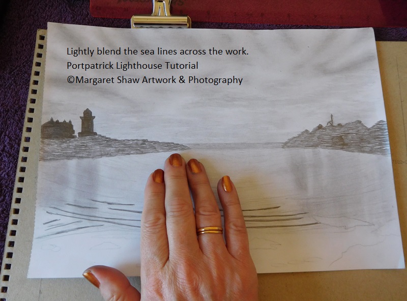
Use three fingers very lightly side to side to blend in the lines. We don’t want the lines to disappear, but we don’t want them to be harsh either. If you do get some harsh lines lift them out with the eraser.Keep repeating lines on and blend until you’re happy with the appearance of the ocean.
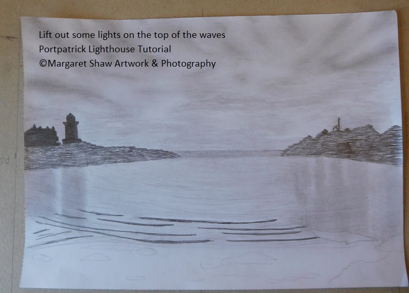
To make the dark waves stand out, take your sliver of eraser and run it along the top of the dark wave lines. Give the eraser a clean between each wave. If you take some of the wave line out, carefully put it back in. This gives a nice dark against light effect.
At this point I decided to add the 4th highlight in the sea at the right.
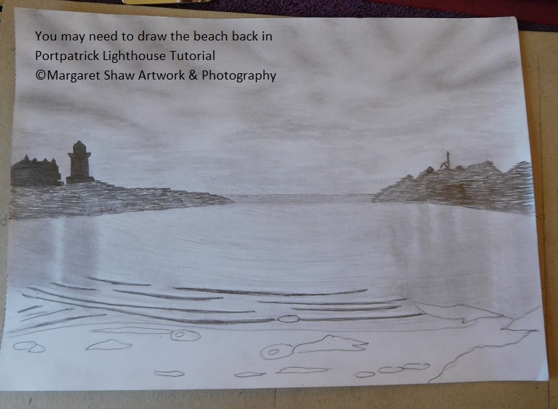
Water complete – onto the beach. If your foreground drawing has disappeared – put it back in.
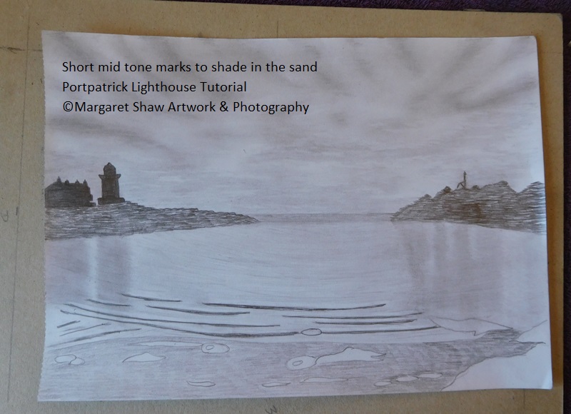
Create the sand by short mid-tone marks to shade. Then gently blend so some marks show.
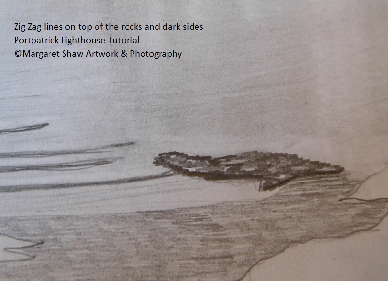
To create the rocks: Put short heavy lines zig zagged on the top of the rocks. As
dark as you can get for the sides of the rock that face you.
Some of the smaller oval rocks are quite smooth so just shade the top lighter than the sides.
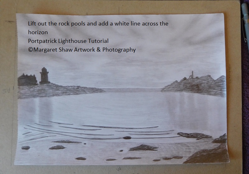
There are a couple of small pools on the beach so lift out the sand shading with the eraser.
There’s also a white line just above the horizon so with the eraser lift a line out.
Time to sit back and have a review. Are there any areas that need to be lightened or darkened.
My tweaks:
- I darkened the large rocks in the middle of the picture.
- The rock reflections on the right were too dark so with the eraser I lifted out lines following the arced lines already there. I really liked this effect so did it all over the water and I particularly like how the reflections of the lighthouse and building look now.
- I added a fine pencil line along the horizon
- I lifted out some of the pencil lines between the large wave and the sand and around the rock in the sea on the right.
Once you’re happy sign your work – I decided to sign on the bottom left.
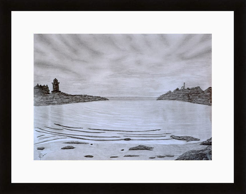
If you’re pleased with what you’ve done its quite amazing what a mount and frame can do for a piece of artwork.
A4 is a standard size and you should be able to buy a mount and frame without much difficulty.
If you’ve enjoyed this tutorial – let me know.
I’d like to see your finished pieces and with your permission I’ll add them to the web site.
E mail me your comments or send me photos of your finished pieces to – margaretshawartwork@gmail.com
Margaret.