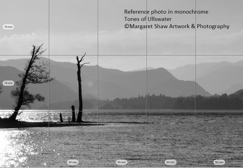
Here’s the photo that we’re going to work from. The image was almost monochrome naturally so I thought it would make a good subject. I did remove all the colour in photoshop (but that’s a separate lesson). We can see we have the lightest areas that will remain white - the water round the trees. The trees are our darkest thing in the picture. Here’s tip no 1 – try to have your lightest and darkest areas touching
You’ll see a grid on the photo which is showing how the image will fit onto an A4 piece of paper. This has been done using the Art Grid app on a tablet. You load an image into the app, tell it what size of paper you’re working on, crop and decide on composition of the photo to fit the paper and the app works out the measurements.
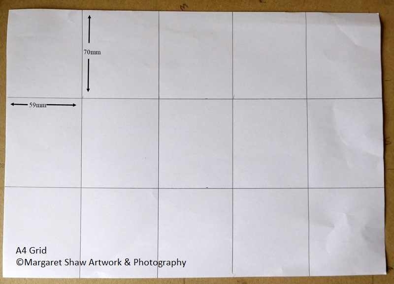
For an A4 piece of Paper you’ll mark out 3 columns horizontally each measuring 70mm and 5 columns vertically each measuring 59 mm
Mark out the grid on your paper as described. Don’t be heavy handed with the grid lines as you’ll want to remove the marks as we start to fill the outline the drawing.
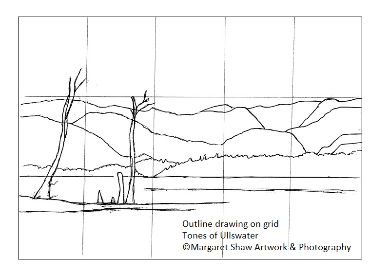
Using the grid as a guide draw the outlines of the scene.
Don’t draw the outlines to heavily. If you make a mistake you can erase them.
If you’re not happy with a line, then draw in the new line before erasing the old one. Experience has shown that if you erase the incorrect line first you’re likely to re-draw it exactly the same way.
I sometimes find it helpful to drawn on the reference image to give myself a feel for where things are going.
Usually I’ll draw the outline image on one piece of paper where I can erase and re-draw as much as needed, then I’ll trace my drawing and transfer that to the workpaper. Re-drawing and erasing can damage the paper which you’ll then find causes problems when shading in.
I also find that during work on my final image I lose the outlines so having a traced copy makes it easy to put them back in
Here's the link to the reference photo that you can view on screen or download and print at A4.
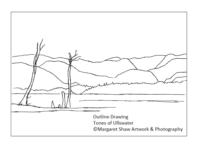
I’ve also provided the outline drawing for view / download and A4 print so you can trace it. By tracing something you are still drawing and with more experience you’ll trace less and less..
The next stage is to remove the grid lines so you have the outline scene to fill in (I did say don’t be heavy handed with the grid). If you have been heavy handed with the grid – trace your drawing and transfer it onto a fresh piece of paper.
This example image has been inked so it would scan well to provide the outline drawing for tracing if required.
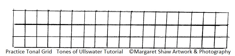
Before we start to fill in the picture, a little practice. We need to be able to create a range of tones with our pencil.
On a spare piece of paper draw a grid (mine’s 1cm squares). Then see how many tones you can get from your pencil. Use the lightest touch to draw the lightest grid and at the other end press on hard to get the darkest grid
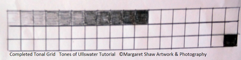
Here’s my attempt – not too many tones but enough to give me a range.
If you have pencils with different leads than you can get a wider range. H pencils give the lightest tones and B pencils give the darkest tones. But, as with this exercise, you can get a range with just the one pencil.
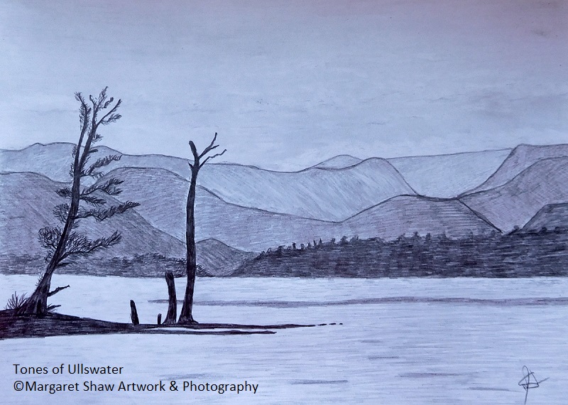
To help throughout your drawing, I suggest you view on screen or download / print the finished piece. Keep looking at this and the reference photo as you work – another saying I try to abide by – look three times and drawn once.
Do remember to take a break occasionally. You can work the picture over a few days. One of the advantages of pencil work is nothing to spoil if left (unless the children or the cat decide they’d like to help)
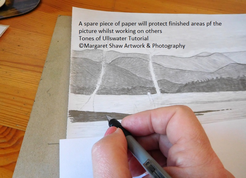
Whilst you are working I suggest you have a piece of paper that you can use to cover your completed areas so you won’t smudge them.
If you do get a few smudge marks – rub them out.
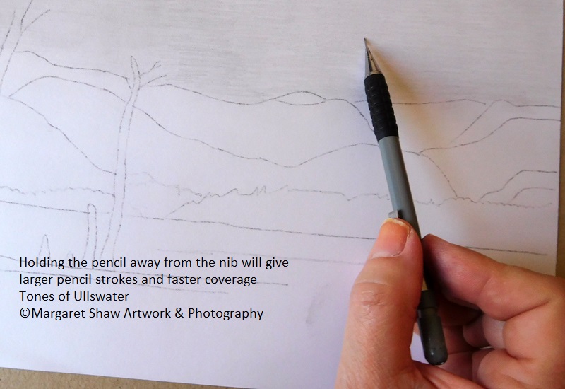
We’ll start with the sky by using the lightest of shading. If you can hold your pencil away from the end then you’ll be able to cover the area more quickly with each stroke.
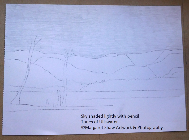
Completely fill in the sky area. Don’t worry about going over the tops as the mountains are all darker than the sky.
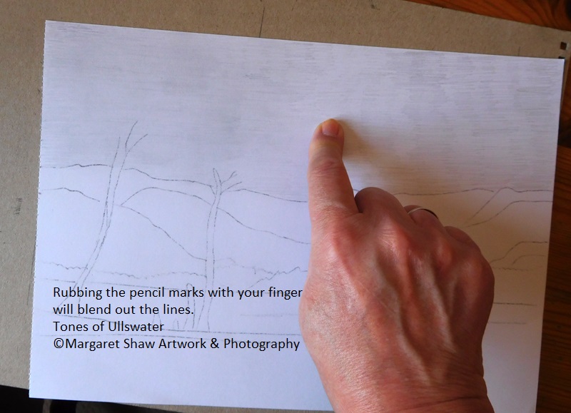
Once you’ve covered the sky, rub the pencil marks with your finger.
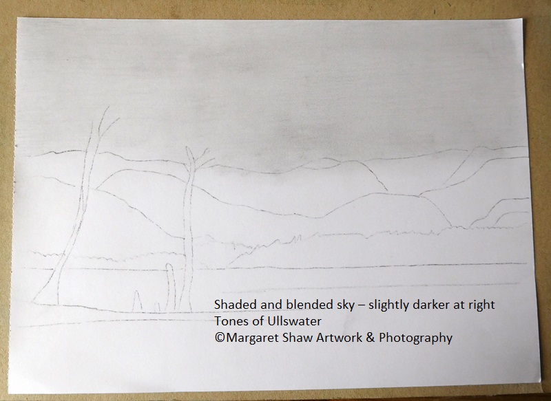
As the sky darkens slightly towards the right of the piece (away from the light source which would be the sun off the top left of the picture), go over the paper again with the pencil using a little more pressure and rub in. Continue to do this until the right of you picture is slightly darker than the left but be careful not to get a dividing line, so really push the 2 areas into each other in the middle.
You may lose the tops of your mountain lines, so put them back in. Don’t worry about going over the tops as the mountains are all darker than the sky.
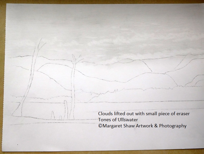
Now you’ve spent time putting the sky in it’s time to lift out the clouds. Cut a small piece of the end of your eraser. Use this small piece to lift out the clouds. There is a main cloud area at the right of the picture over the top of the mountains and a 2nd main cloud area halfway up the sky. Use a circular motion to create the tops of the clouds and a side to side motion to create a straight(ish) line at the bottom of the clouds halfway up the sky.
Lift out a few very random dashes in around the main cloud area.
You may want to have a practice on a spare piece of paper before starting on your main work.
If you get any harsh edges (clouds don’t have harsh edges) then rub along these with your finger and they will soften.
Onto the mountains.
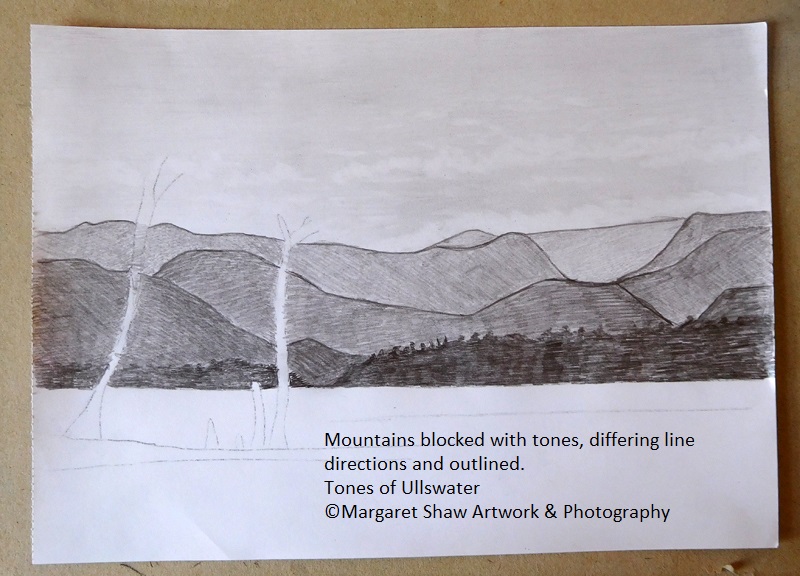
As you come forward the tone of the mountains darken with the front line trees quite dark ( the main trees in the foreground will be your darkest tones so you need to leave the darkest of tones for those ).
I have to admit that some of my tones are fairly close because I did the far away ones a little too. dark.
Running your blocking in different directions will also help create distinction between the mountains. Top left to bottom right and top right to bottom left with different angles. Even horizontal.
The dark trees at the front are horizontal smaller marks and make sure that the tops of the trees are random with some spikes to represent the tops of pine trees.
Outlining the mountains gives more differentiation and that’s a matter of personal preference
There was a little incidence at the middle right of the mountains when I realized that after a break, I was working from the wrong reference picture. A bit of outlining and a change of line direction remedied this
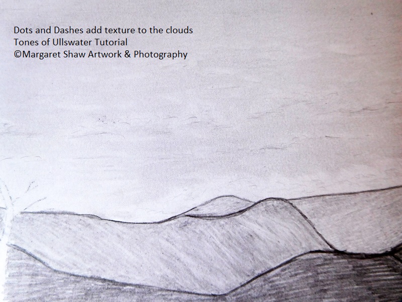
On sitting back from the picture I decided that the sky needed a bit of a tweak in the clouds.
A few small light dashes and swirls have added a little texture to the clouds. You need to use the lightest of touches and a little rubbing in with the finger to smudge and blend the dashes and swirls will help.
If you decide to do this, as you will be leaning on your work, protect the mountains with a piece of spare paper.
If you’re happy with the clouds as are then leave the dashes and swirls out.
Moving into the water.
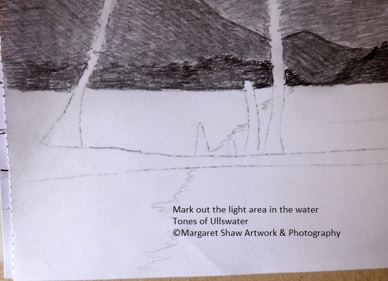
To reflect the lighter area of the sky at the left of the picture, put a squiggly line where you want the lighter area of the water to end. I’ve put mine through the trees. Do this very lightly as a guide because the line will need to disappear as you shade in the transition from dark to light in the area
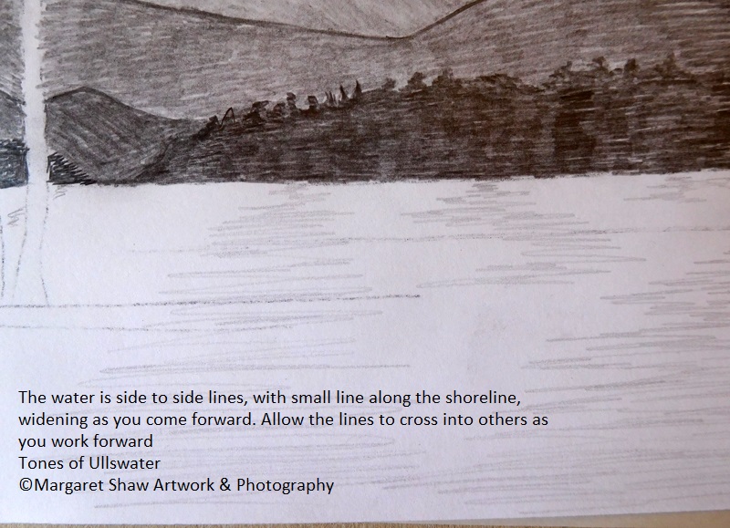
The water lines are created with side to side strokes. Short at the back and lengthening as you come forward to give an appearance of distance in the water. Work up to your ligh/dark dividing line.
The right side of the work will require more heavier lines than the middle to create a tonal difference across the water.
Don’t worry about shading into the trees as they are going to be very dark so shading will disappear.
Once you get to the dividing line between light and darker, rub out the guideline.
Then at the left of the work rather than side to side lines just do dashes so you leave white paper showing. Again small at the shoreline and larger coming forward.
If you find that you’ve put too much pencil on the light area – lift out a few lines with the eraser.
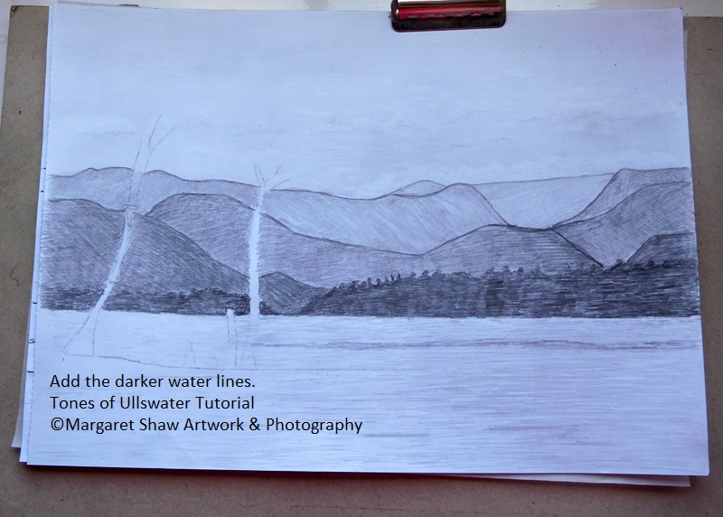
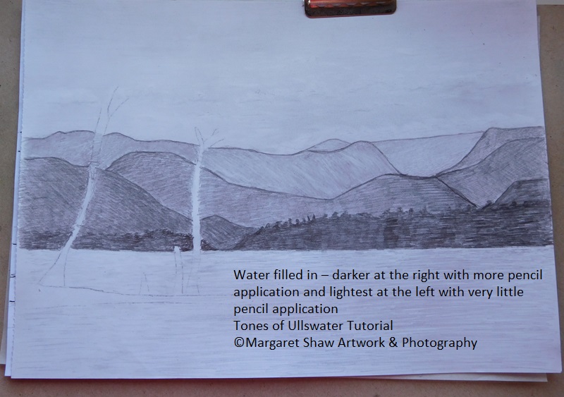
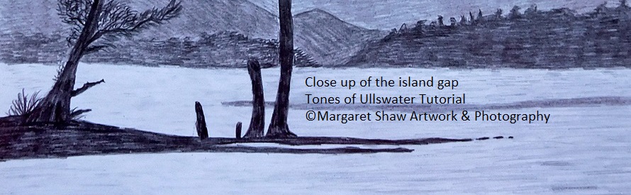
Looking at the reference photo behind the trees there’s a dark area of water running from the right of the picture up to the right tree. To be a little more pleasing on the eye in the finished image I extended it to just over the smallest stump.
There’s also a few dark areas in the foreground water. These need to be randomly placed and be of differing sizes.
Now onto the darkest thing in the picture, the island and the trees. Close observation of the reference and the finished piece will give your work an edge.
As you’re working over the top of what you’ve already done, use a piece of paper under your hand to protect your work.
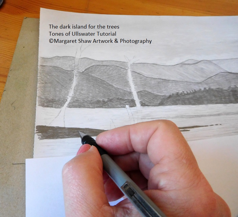
With the heaviest of pressure fill in the land area.
Use horizontal strokes and make sure you leave a gap in the island.
The lengths of the fingers are different with the longest at the back and then a few dashes to represent bits of the island under the water.
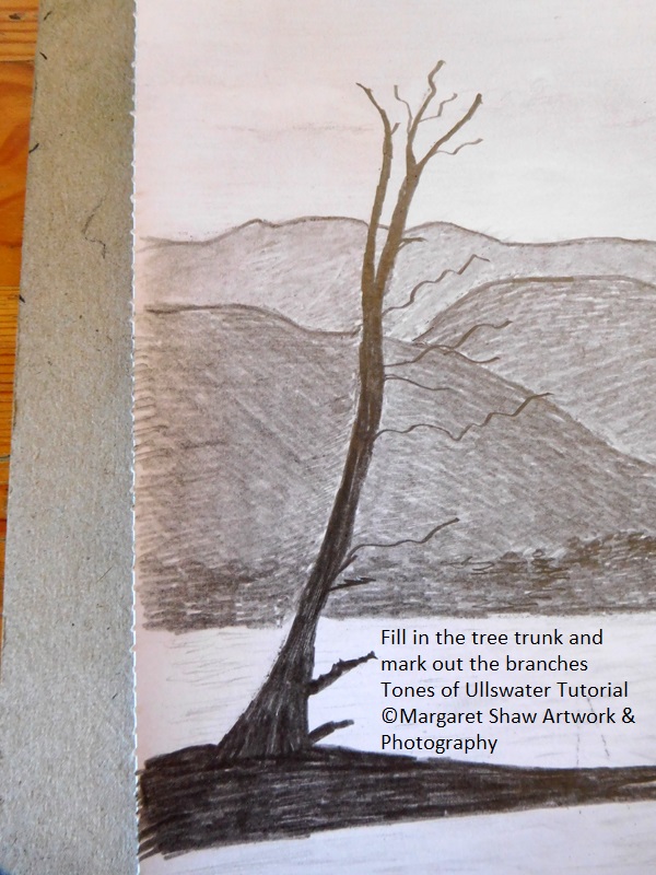
Once the land is in place start with the largest tree and fill in the trunk. Note the spilt is in the area of the furthest away mountain.
Again protect others areas of your work with the spare piece of paper.
The directional pencil strokes for the trees is vertical. You may find it easier to turn your work onto it’s side. Once the main trunk of the tree is in place mark in the branches. To get the branches squiggles try turning the pencil in your fingers as you pull away from the tree trunk. Have a go on a spare piece of paper. Once you’ve the branches in position, go over pressing hard with the pencil
Next job on the large tree is the twigs. These are small dashes to form the shapes of the twigs. Refer to the finished piece or the reference photo to view the outlying shapes.
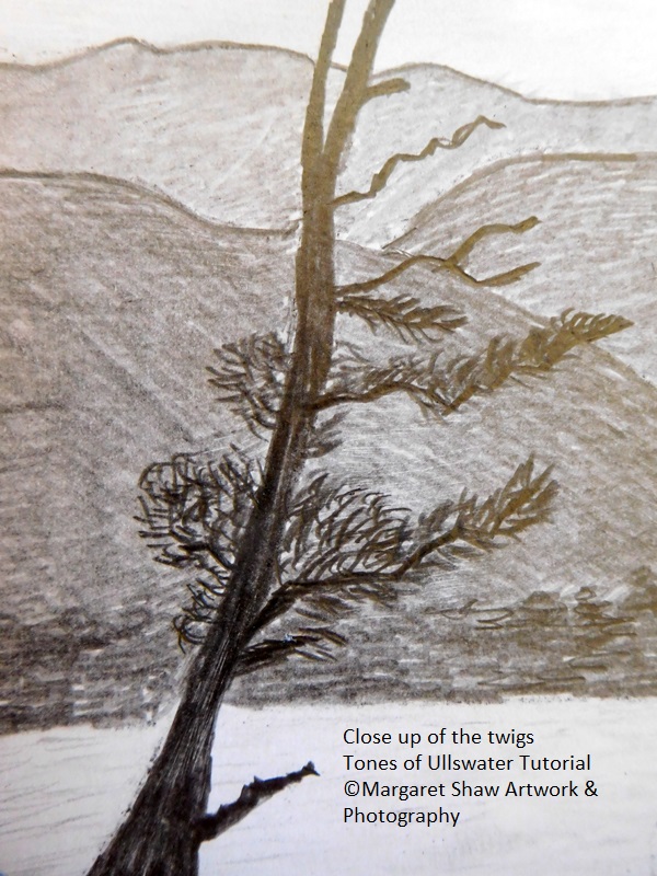
Here’s a close up example of the pencil marks. Take care not to go overboard. There’s plenty of space between the branches/twigs. Remember that piece of practice paper?
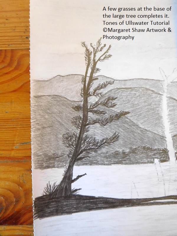
A few grasses at the base of the tree complete it. Flicks of the pencil – up straight, up right curve and up left curve.
The dead tree and stumps have no twigs but the shapes and sizes are interesting.
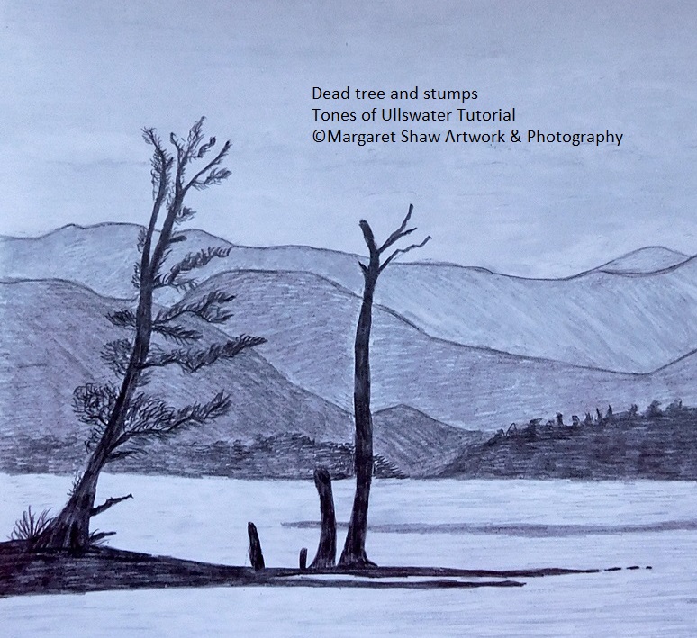
The small stump on at the left leans to the left, has a kink on its left side and is quite pointed at the top.
The smallest stump is just up and down but is significantly smaller than the others and has a square top.
The one next to the right end has a left curve to it and is rounded at the top.
The right tree has a foot at the bottom right. It curves right then left and right again before splitting near the top area of the mountain. There’s a slight squiggle in the right branch. The left branches have a small point on the bottom and a square on the top

Once all complete have a review. Are there any whites that need to have smudges removed and are there any tones that need to be darkened?
At this point I lifted some of the pencil work out of the water on the left to give this contrast between the dark trees and the light water. To balance the darkness of the trees I darkened the pine area at the bottom right of the mountains.
Once you’re happy sign your work. I decided to sign on the bottom right for this one.
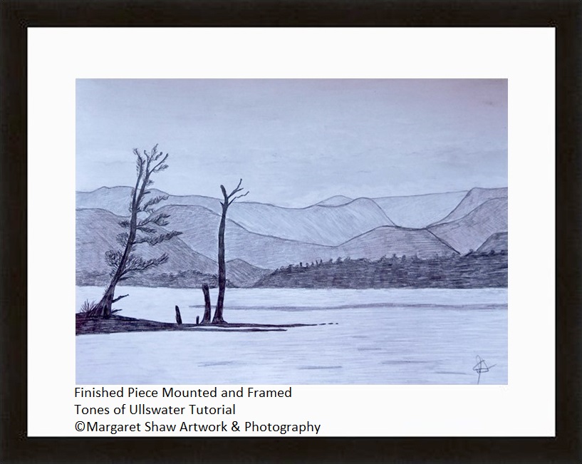
If you’re pleased with what you’ve done its quite amazing what a mount and frame can do for a piece of artwork.
A4 is a standard size and you should be able to buy a mount and frame without much difficulty.
If you’ve enjoyed this tutorial – let me know and I’ll create some more let’s draw sessions along the same premise of let’s draw using every day materials.
I’d like to see your finished pieces and with your permission I’ll add them to the web site.
E mail me your comments or send me photos of your finished pieces to – margaretshawartwork@gmail.com
Margaret.